|
 Colour Prejudice and William Yarrell Colour Prejudice and William Yarrell
by Isabelline Books
On one of my regular visits to a second-hand bookshop in the West Country a few years ago I bought a set of William Yarrells A History of British Birds. It was not a particularly nice set, the cloth covers were worn and scruffy, but internally the books were unusually clean and bright. While I was paying for the books the owner made a rather disparaging remark about Yarrells British Birds - how he was sick of them and how difficult they were to sell etc. This struck me as a
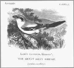
rather unreflective remark because I have always considered the engravings in Yarrell to be quite fine.
The booksellers remark led me to think about the current neglect and lack of appreciation of some of the older ornithology books, in particular where there are no colour plates but only black and white engravings coupled with an often lengthy description.
We now have an annual flood of bird books with impressive colour plates. Rather than using colour photography many of these handbooks and guides contain colour plates which derive from the work of illustrators. This over-production of ornithology titles is probably responsible for the disdain for many of the earlier books. Bewick may well be the exception, the early editions still fetching high prices.
The first really popular ornithological work that was used as a recognition and reference manual was Yarrells History of British Birds. The engravings in this work, first publshed in 1837, were still being used well into the 20th C. and last appeared in Howard Saunders Manual of British Birds published in 1927, so were in print for nearly 100 years.
In 1920 the 3-volume Practical Handbook of British Birds by Witherby et. al. was published. This has 30 colour plates of dubious quality, and even the 5-volume Handbook, first published in 1938 also by Witherby, has colour plates which vary a lot in quality. So in these handbooks the colour descriptions were still most imortant in accurately describing plumage. It was not until the 1970s that cheap colour printing became more reliable.
I believe that hand-colouring actually diminishes, rather than improves the descriptive precision of a detailed engraving, with its emphasis on texture and markings, in conjunction with careful use of colour terms. I doubt whether the introduction of hand-colouring to engravings and
later to lithographs was an improvement to the accuracy of depiction compared with the combination of highly detailed engravings, showing texture, markings, and structure and a comprehensive description using an imaginative glossary of colour terms. Colour was certainly a tool for prettiness and the enthusiasm for Victorian and earlier hand-coloured plates of birds is without question, but did these images provide the ornithologist with more information or did they tend to obscure the detail already present?
Yarrells History probably contains the richest collection of colour descriptions in any bird book in the English language, and although some of these terms were used in subsequent works, and to some extent today, they have been modified and the more bizarre similes excluded. It is worth looking at how these terms came into the language of the English naturalist.
The early naturalists in England had a problem with their use of colour terms in that there was no concensus as to their precise meaning. Ambiguity and confusion were common, some terms even having several quite different meanings. The written terms were derived from Latin - some of which are still in use today. In 1677 a most remarkable work was published by Walter Charelton, Exercitationes. This contains an Appendix, a glossary of colour terms and an attempt to impose a consistent meaning to their use. The terms that the naturalists used were similes, while those used by painters were the names of the pigments, the stuff itself. Charelton defined 16 terms for yellows (The Latin terms with their English equivalents), 16 reds, 10 blues, 9
greens, 5 purples, 7 greys, 6 browns, 3 bays, 11 whites, and 7 blacks. These contained such colours as coracinus - raven black, murinus - mouse-colour, mulvinus - kite colour, columbinus- dove-colour, and mustelinus - weesel-red (contemporary spelling). So as you can imagine there was plenty of room for confusion.
In Yarrell we find various parts of the Bee-Eater described as verditer blue, saffron-yellow, chestnut, duck-green, verdigris-green, buff, greyish-brown and fawn colour. The Roller as berlin-blue, brownish-yellow, coppery-purple and light cinnamon. The Spotted Eagle as chocolate-brown, pale wood-brown and reddish liver-brown. The Golden Oriole had lead-colour toes, other parts oil-green, brocoli-brown and wine-yellow. The Cuneate-Tailed Gull was smoke-brown and pearl-grey, the Turnstone had ferruginus portions, the Little Auk was livid-brown and sooty-brown, while the American Bittern was leaden-brown.
The variations in these terms seems to be inexhaustable. They can now be considered a curiousity, somewhat romantic or just pure pedantry on the authors part. But it was a serious attempt to try to define quite subtle colourings. These colour names did act as an aide-memoire to the field ornithologist. For who can remember a colour without giving it a
name?
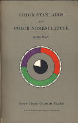
 One man who tried to bring some order and consistency into this chaotic situation was Robert Ridgway, Curator of the Division of Birds, United States National Museum. His Color Standards and Nomenclature was privately published in 1912 in Washington D.C. It is clearly stated in the Preface that The motive of this work is the Standardization of Colors and Color Names. This work contains Fifty-three Colored Plates and Eleven Hundred and Fifteen Named Colors. Each colour was hand-printed. The irony is, of course, that the colours are susceptible to fading so cannot be exposed to light for very long. The names chosen are a mixture of pigment names, those used in industry and those derived from the Latin, such as the names in Chareltons glossary. So we still have Cinnamon-buff, Vandyke-brown, Vinaceous-tawny, Violet Ultramarine, Ferruginous, Carrot Red, Lettuce Green and Cobalt Green.
Even the nine volume Birds of the Western Palearctic, completed in 1994 contains lengthy and detailed colour decriptions of plumages as well as colour plates from illustrators paintings. Here we find familiar terms used such as tawny-yellow, rufous-cinnamon, cinnamon-buff, oil-green, fuscous-brown, fuscous-drab, red-chestnut, brown-horn, chocolate-brown, plumbeous, and toes still leaden-grey, but no colour key to go with the terms. I would prefer Yarrell with his marvellous repertoire of colour names and exquisite engravings. But then I am writing as a bookseller
and not a bird-watcher.
For those who may wish to share an infectious enthusiasm for the marvellous names of the colours found in older books, I would recommend Field Green by H.R. Goodchild. A charming memoir, not altogether reliable, of a boy growing up in a secluded valley in Devon who becomes fascinated by birds, their strange migratory patterns and habits. Field Green is published by Isabelline Books.

|

